-
“Refraction painting” is a term I use to describe a body of colour-based works that employ semi-transparent acrylic surfaces to scatter light waves, creating real-time refraction events. In these works, colour and form act as vehicles to reveal the behaviour of light within the frame, drawing attention to the optical qualities of the material itself.
This line of inquiry emerged from an earlier photographic portrait series in which I experimented with Polaroids and other film formats shot through bespoke lenses. Using sheets of glass and acrylic treated with pigments, wax, and surface interventions, I sought to make photographic portraits feel closer to painting. While the initial results were compelling, the process of translating these images into painted works framed behind frosted acrylic revealed that my true subject was not the figure, but light itself—the mechanics of perception, and the subtleties of vision. The presence of a face within the frame became a distraction from this inquiry. In one body of work, I stripped away portraiture—a previously central element of my practice—and entered a new phase of experimentation, one concerned with sensory perception and the study of light as material.
My broader interest has long been in questioning and subverting the formal traditions of painting. These works, though read as paintings due to their rectangular format and their position on the wall, operate in many ways as sculptures. Their logic is rooted in material and spatial concerns, rather than the surface-based conventions of painterly gesture. The introduction of the frosted acrylic screen effectively transformed the work into a lens, blurring and distorting what lies beneath, and in doing so, foregrounded perception itself as the subject. Instead of producing static abstract representations of natural phenomena, I developed material means of enacting these time-based events directly—works that draw attention to the durational aspects of looking, and to the instability of light as it shifts across surfaces.
This process also unsettled my own attachment to the identity of being a painter. Is it still a painting if we cannot see the paint? While colour and luminosity remain perceptible, the tactile qualities most often associated with painting—texture, mark, surface—are absent. The elimination of one element allows another to become amplified: colour emerges as a central presence, though for me it has always been secondary, a structural support for the light refraction produced through this specific framing method.
The conceptual lineage of this work connects to artists who have similarly destabilised the categories of painting and photography. Uta Barth’s painterly photographs, with their soft focus and dissolution of form into diffused blocks of colour, blur the boundary between medium and perception. Equally formative were Anish Kapoor’s Void Field works (1989), immersive installations that profoundly altered my own perceptual awareness. Kapoor’s fields evoke the infinite by suspending depth perception, an effect that resonates with my own exploration of light as both material and perceptual event.


-
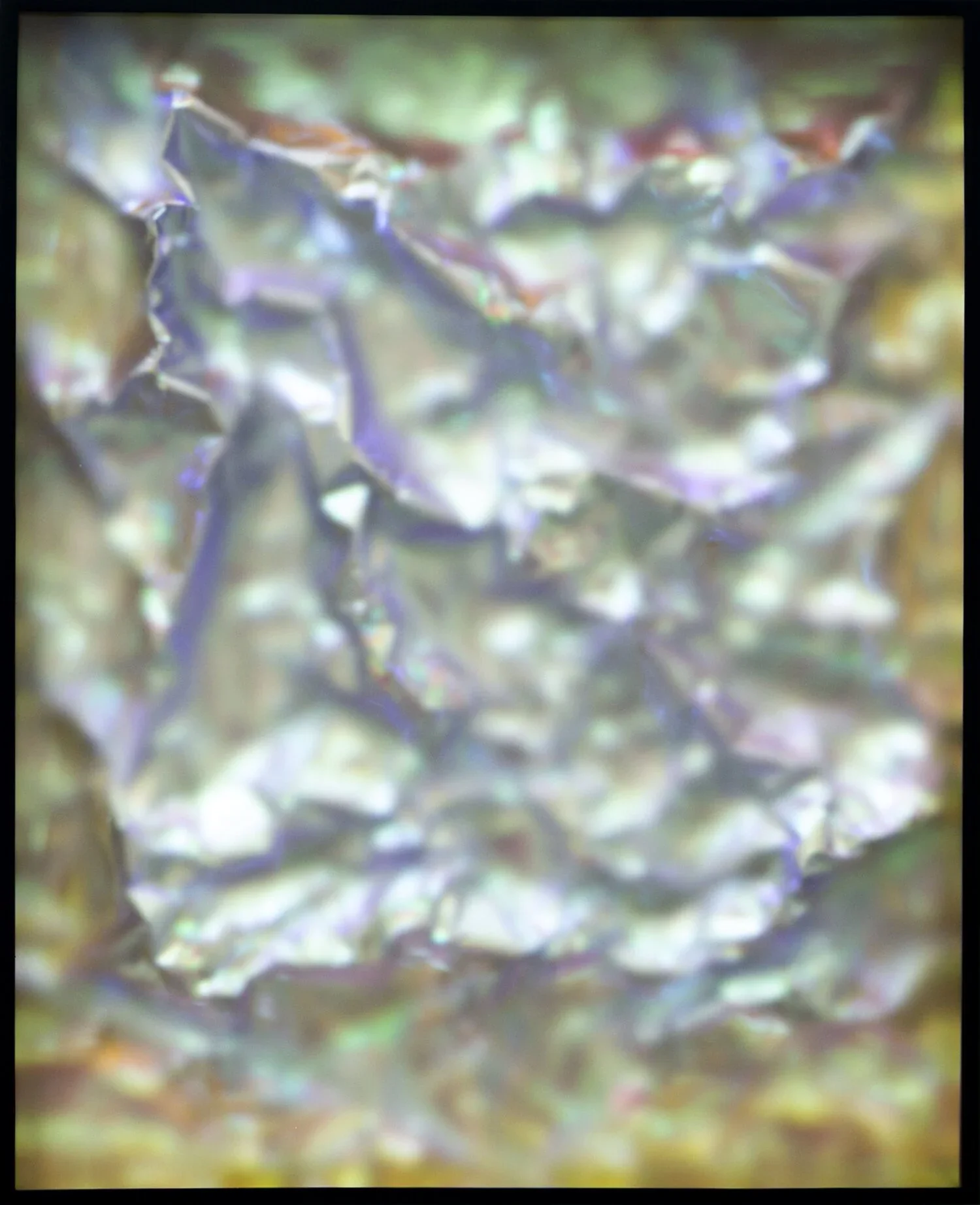
Deep Field designates a series of works in which three-dimensional structures are positioned behind an acrylic screen. By extending beyond the flat pictorial plane, these works bring sculptural depth into play as a condition of perception. The acrylic surface functions as a lens, mediating between viewer and form, and creating visual effects that recall the mechanics of photography.
The optical qualities of each work depend upon proximity. Materials near the acrylic screen appear sharp and saturated, while those further back blur into softness, producing a gradient of focus akin to photographic depth of field. Early studies used hand-modelled sheets of painted aluminium, while later iterations employed dichroic film and reflective materials to intensify luminosity and chromatic complexity. As light ricochets between surface and form, ghost images emerge, colours shift, and the works appear to glow as if animated from within.
This glow produces a subtle dissonance: although the works are resolutely material, their blurred depths and spectral reflections evoke the language of digital screens. This tension positions Deep Field within a lineage of practices that interrogate perception itself—from the perceptual instability of Op Art to the phenomenological experiments of the Light and Space movement. At the same time, the series speaks to the conditions of the digital age, where the saturation of screen-based imagery has reshaped our habits of seeing.
My intention is not to replicate photography or digital motifs, but to engage critically with them as unavoidable frameworks of vision today. Deep Field positions itself as an interface between perception, materiality, and light—an unstable terrain where recognition falters, and new ways of seeing may emerge.


-
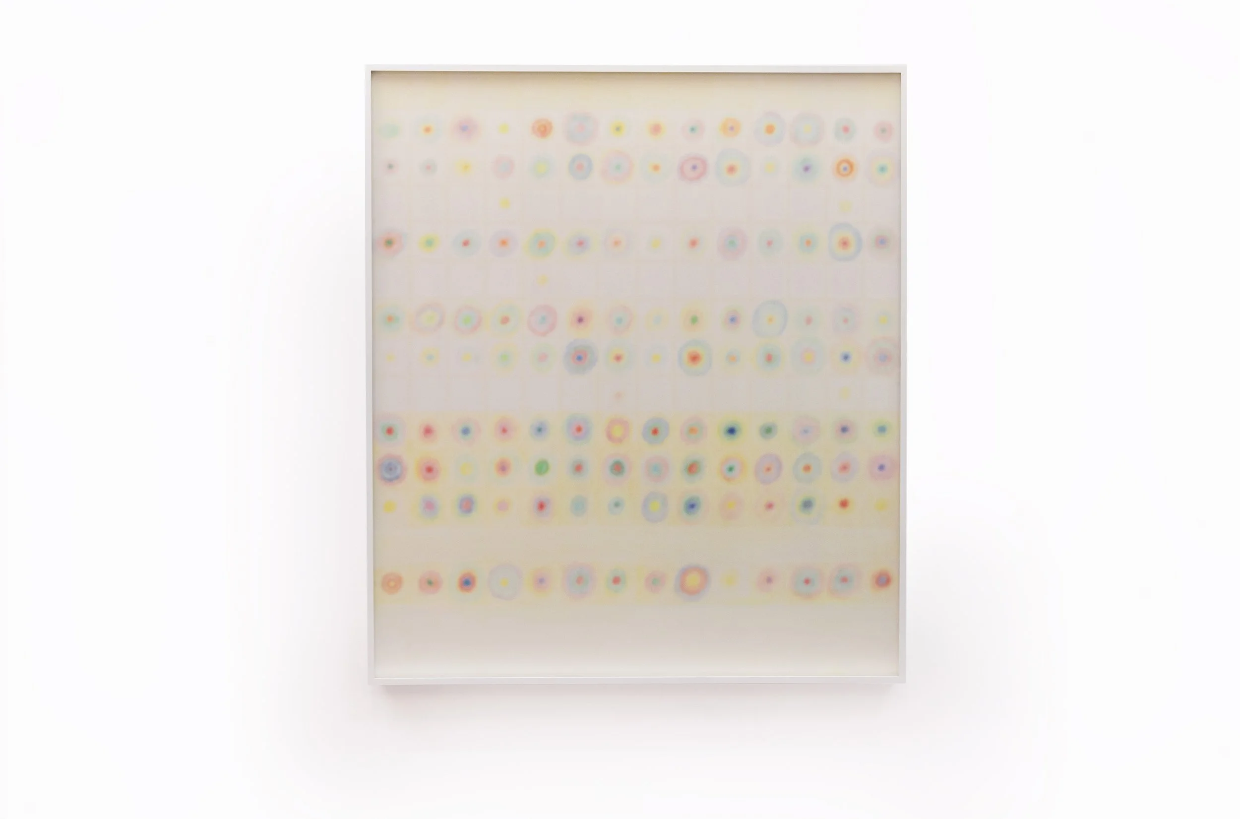
This body of work investigates the generation of what I term phantom colours—hues that arise not from pigment itself but from optical phenomena. When light refracts through a frosted acrylic screen, the eye perceives colours that are not materially present on the painted surface. In this way, the works create chromatic events that occupy an in-between zone, perceptible yet immaterial.
Bands of pigment, placed at carefully measured intervals, serve as the foundation of this effect. Two adjacent hues, such as red and blue, can produce the perception of a purple that exists only in the viewer’s vision. The size and intensity of these phantom zones vary depending on both the spacing of the bands and the distance of the acrylic screen from the painted ground.
In developing this series, I was mindful of precedents such as Carlos Cruz-Diez, whose work in the mid-twentieth century transformed colour into an active, temporal experience. His installations and paintings invite the viewer to move, shifting the perceptual event through their changing position in space. My own approach shares this interest in colour as dynamic and relational, but diverges in the use of a frosted acrylic screen. The screen introduces a sculptural and refractive element, generating phantom colours through light itself rather than solely through the juxtaposition of painted pigment. In this way, the work extends the perceptual dialogue into a more interactive and three-dimensional register.
When the colour bands are evenly spaced, the works generate dazzling, almost dizzying, optical effects. However, without variation, the significance of phantom colours is less apparent. By adjusting the scale of the bands, I establish points of comparison: large colour fields emphasise distinction, while smaller, compressed bands intensify the perceptual blending that generates new hues.
Ultimately, Chromatic Synthesis functions as both an experiment and a learning tool. It explores how simple chromatic structures can produce a far wider perceptual spectrum, and in doing so, it suggests parallels with sound. Just as overlapping frequencies generate harmonic relationships, colour intervals produce perceptual hues that transcend their material base. My hope is that these works invite viewers to consider colour not as a static property, but as a dynamic, relational event—something that, like music, exists most fully in the moment of perception.


-
This series unfolds the idea that sound may be translated into abstract visual systems, drawing upon the long tradition of graphic notation. The term eye music itself refers to a form of visual composition that dates back to the fifteenth century. One of the earliest known examples is Belle, bonne, sage by Renaissance composer Baude Cordier, written in the shape of a heart so that its form enriched the meaning of the music. Such experiments established a precedent for visualizing sound through symbolic or abstract means.
My works build on this lineage while also reflecting on the experimental traditions of indeterminacy pioneered by John Cage. By adapting forms drawn from conventional musical notation—grids, circles, and linear structures—I have developed a system of drawing that is at once playful and ordered. The process echoes the improvisatory nature of music while retaining an underlying sense of calm structure.
In these works, circles within circles are arranged across horizontal registers, suggesting the linear flow of musical time. Each circle functions as a harmonic unit, a cluster of frequencies interacting in relation to the others, so that the entire composition reads simultaneously as a pattern and as a field of organic relations.
The frosted acrylic screen, also central to my Chromatic Synthesis series, plays a crucial role here. It diffuses the edges of each hand-drawn circle, producing phantom hues in the intervals where colour rings overlap. These spectral tones behave like chords or clusters in music—sometimes resonant, sometimes dissonant—as adjacent frequencies collide and interact. In this way, Eye Music extends the chromatic investigations of Chromatic Synthesis into a visual language that parallels the harmonic and polyphonic structures of sound.